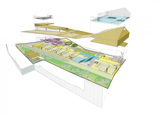
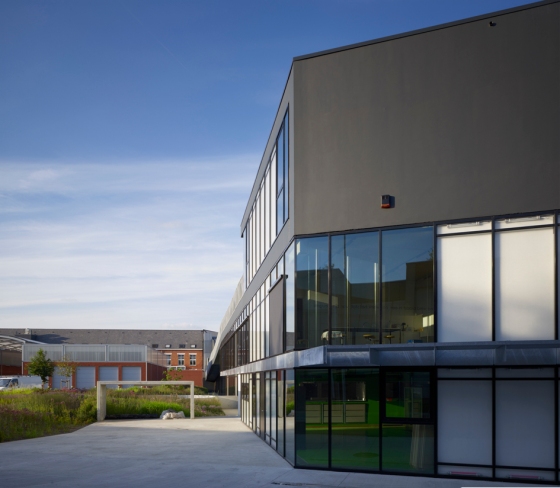
Library + Restaurant + Multifunctional Space by BOB361 Architects, Dendermonde, Belgium

BOB361 Architects completed this multifunctional building, that is located in Dendermonde, Belgium. It’s situated between the main of the city and the green bank of the river called ‘Dender’.

Three urban strategies lead to the creation of a new connection of these two contrasting atmospheres.

  1. The historical fortifications are transformed into a greenbelt around the centre of the city. The green passage along the library completes the missing link in this structure.
  2. Within the urban fabric the complex introduces a new hangout-place, enriching the social network. The presence of schools and the diverse program will activate the site day and night.
  3. By creating a physical pedestrian walkthrough, connecting the main shopping axis and the recreational green area, a critical mass of people can penetrate the site.

    The passage gives the building four active façades. For more info, please click here

Via Archdaily
Pictures by Andre Nullens

VISIT BOB361 ARCHITECTS

The Narrow House by Bassam El-Okeily, Bilzen, Belgium

Bassam El Okeily designed this very interesting house in a small city called Bilzen in Belgium. Bassam El Okeily designed this house for a couple passioned by history and art.

The house has a closed ground floor exterior (entrance & garage) topped by a total transparency in glass. The display window reveals two balconies in skewed positions projection from a white façade.

The lower balcony contains a reading corner for a library belonging to the gentleman of the house, while providing him with a sheltered view of the street. The upper balcony accommodates an artist’s studio, the private domain of his wife. Blue light turn the façade into a spectacular light sculpture after dark.

Architecture become a pretext to chair something else than the sidewalk. A house is a space to live; it could also be a place to remain.

what‘s a house? A space to live, to project our happiness between four walls, then to spread out our vanity outside these walls.

Can there be space for something else?
A space for our melancholy, our scars, Then the luggage of our memories.

It is a narrow house which leaves with its threshold, our thousand and one smooth and invented lives.

It is a narrow house which offers to a narrow street: the history of a man, a woman and their passions.

History of a house imagined to live. But also to remain.

Special thanks to Bassam El Okeily for sharing!
Photography by Tim Van de Velde

Client: Mr Menten & Mss Bienkens
Architect:
Bassam El Okeily
Architect Collaborator :
Karla Menten
Statics:
Ingineer Ten Half

VISIT BASSAM EL OKEILY

Notariaat by Atelier Vens Vanbelle, Horebeke, Belgium

The peaceful landscape is framed through the windows like colourful paintings in the white interior.

Belgium based architects Atelier Vens Vanbelle , completed this awesome project in a small village called, Horebeke in Belgium. The office building has a brick facade broken by huge windows overlooking the surrounding farmland.

The offices, waiting room and kitchen open out to the views on two sides, turning away from the adjacent street and restaurant.

Here are some more details from the architects:

The building site is situated at the end of a small street in the small village of Horebeke in the Flemish Ardennes, next to a restaurant. The view from the site is splendid: the landscape slopes slowly and offers an overview to an untouched agricultural area spread over two kilometers.

This kind of impressive landscapes asks for discrete admiration, just like the design assignment itself.

A notary must be a building that establishes itself in a neutral way and it should be accessible for each type of visitor. We believe building in a landscape like this asks for the same kind of neutrality. This was translated in a rough brick volume which is semi-closed to the street side and the restaurant.

The entrance to the building is marked by a white volume made of steel plates. Walking through this white volume, the visitor enters a corridor looking out over a patio on the right side.

On the left side the corridor bends to the waiting room which opens cone-shaped to the landscape. The kitchen and the offices open in a similar way to the outside. The peaceful landscape is framed through the windows like colourful paintings in the white interior.

The back of the building cantilevers over the sloping terrain. The staff can park under the building and the cars form no visual obstruction from within the building.

Special thanks to Maarten en Dries for sharing!

You can download the project in a pdf on their website or click here

VISIT VENS VANBELLE

House VVDB by dmvA, Mechelen, Belgium

Belgium Architects dmvA completed this interior for a post-modern pyramid house in Mechelen, Belgium.

VVDB house was mentioned as a statement for the eighties, since it has the main characteristics of eighties period building in Flanders, Belgium. The characteristics can be seen from the roof-type, symmetrical ground plan, wooden structure, honest materials, the use of cement stone, and many-colored aluminum joinery.

In the eighties architect Jan Van Den Berghe built his own house on a marvellous spot, close to the channel Mechelen-Brussels. Roof-type, symmetrical ground plan, wooden structure, honest materials, the use of cement stone and many-coloured aluminium joinery, were the main characteristics of this period building periode in Flanders.

The post-modern pyramid house was a statement for the seventies/eighties. Architect Van den Berghe requested dmvA to refurbish his own house for his daughter. No spectacular alterations, but subtle interventions, round perforations through the floors, a new central spiral stair, ‘whitening’ of the floors. Altogether an architectural attitude based on respect!

More info and pictures on Archdaily!
Pictures by Frederik Vercruysse

Other articles of DMVA on ArchiDE:
+ Blob vB3 by DMVA
+ House S by dmvA Architecten, Mechelen, Belgium

VISIT dmvA ARCHITECTS

Museum Aan de Stroom by Neutelings Riedijk Architects in Antwerp, Belgium

The new Museum Aan de Stroom (MAS), designed by Rotterdam-based Neutelings Riedijk Architects as a sixty-meter-high tower landmark in Antwerp, Belgium, has recently been completed! During one week in May, the public could visit the new building on guided tours but ow the MAS will be closed for another year to move the collection and set up the exhibitions. The official opening is in Spring 2011.

The new museum is between the old docks in the heart of “Het Eilandje”. This old port area is the major urban renewal project in the center of Antwerp and is developing as a vibrant new city district. More information via Bustler

Program: New Development | Museum for City History Antwerp, Museum, Restaurant, Party Room, Pavilions, Plaza
Surface area: 19,557 m2 Floor surface, 11,415 m2 Outdoor construction
Construction costs: € 33.409.000 (including construction of the pavilions and plaza, excluding design, scenography, VAT, fees and indexing)
Location: Hanzestedenplaats | 2000 Antwerp | Belgium
Design: International Competition | 1st Prize | April 2000
Start construction: October 2006
Realization: February 2010
Architectural design: Neutelings Riedijk Architects | Rotterdam | The Netherlands

Photography by Sarah Blee

VISIT NEUTELINGS RIEDIJK ARCHITECTS

Greenhouse by Verdickt & Verdickt Architecten, Asse, Belgium

Located in Asse, Belgium, this house called ‘Greenhouse’, is designed by Verdickt & Verdickt Architecten and stands out because of its affordability and heat trapping ability.

The house is furnished minimally with whites and woods to complement the feeling of ‘openness’ that prevails throughout the abode. Such is achieved through the reverted house layout in which the private quarters are located below whilst the rest of the house is located above and set in an open-floor concept. This way, the architect is able to take advantage of the elevation to highlight the foliage and surrounding scenery through the floor-to-ceiling windows as well as attain ‘openness’.

In contrast to the second storey, the private quarters beneath is arranged in a ‘closed’ manner with narrow corridors and minimal windows.

Photography by Luc Roymans

VISIT VERDICKT & VERDICKT

Fiat Lux by Label Architecture, Brussels, Belgium

Transparency, reflections and connections between the different levels determine the daily routine of the large family living in.

Brussels studio Label Architecture have transformed the interior of a family house in Brussels, Belgium, by covering some walls in rough, black-stained osb and painting others white.

It consists in the transformation of a 270 m² family house. A punctual intervention, centred on the heart of a traditional house in Brussels, gave to this dwelling an outstanding character. Transparency, reflections and connections between the different levels determine the daily routine of the large family living in. From the first floor, the stairwell was entirely emptied on the three higher-ups levels.

A staircase in openworked metal links together the two first floors. At each level, glazed windows were handled with care, on all the height of the dividing wall, bringing a real physical feeling, not so far from vertigo. Some of them are pierced by little round openings, allowing inhabitant to communicate from a level to another one.

Behind the windowpanes, the platforms, transitions spaces, were covered by OSB stain in black, creating a mirror effect to those who look at them from the opposite openings. In front of this openings, mirrors were installed on the blind attached wall. The family benefits the unexpected connections of this surprising arrangement, worthy of Lewis Caroll.

*Label architecture is an architectural practice based in Brussels, Belgium. Its three partners, Jean-Didier Bergilez (1974), Michel Lefèvre (1978) and Thibaut Rome (1977) opened their agency in October 2004. Their projects, on various scales, are as much an opportunity to play with existing space, from their common reference points, as not to take themselves too seriously while being serious about their work.

Via furfin
Photographs are made by
Bepictures

VISIT LABEL ARCHITECTURE

Zoersel House by Arjaan de Feyter, Zoersel, Belgium

This house was designed in 1969 by architect Herman Andriessen. A year after completion he passed away. In 2005 interior architect Arjaan De Feyter and his wife bought the house which was in total decay and ready for demolition.
In notion to Bauhaus this steel house was originally designed as a prototype in 1969 that could be erected elsewhere on the still largely empty residential estate. The original plans show a villa with steel skeleton and a half-open ground floor that reminds us of the Villa Savoye, with its central core and industrial materials. The steel skeleton forms a perfect grid of nine squares two storey’s high. The domestic functions were clustered in the nine squares on upper floor, and on the ground floor filled two of them with an entrance hall, a staircase and a storeroom – the rest formed a sort of open carport.
This intention of reproduction on a large scale did not come true, however the surrounding landscape, at that time still almost unspoiled, has in the meantime been covered in homes in the ‘fake-farmhouse-style’ and the steel house, built as a Case-Study house, stayed on its own and has been converted and extended unrecognizably. For example; the house gradually filled in the ground floor to gain space, also temporary measures were taken to remedy chronic technical problems.

In 2005 interior architect Arjaan De Feyter and his wife bought the house which was in total decay and ready for demolition. They retained the original plan of the first floor, which is where they were to live.

They extended the ground floor so as to install a workspace, whose visual impact they mitigated by means of large glass walls with profiles that were barely visible. The house was first stripped down to the steel skeleton and the vaulting. The steel was seriously corroded in many places and had to be restored. The aluminum sandwich panels and the original wooden windows, now double-glazed, were then fitted back into the renovated skeleton. A lot of attention was paid to designing new and better joinery details.

The biggest challenge in the renovation was the problem of cold bridges that is characteristic of steel skeletons that are also exposed to the outside. The solution was provided by a quick-drying two-component resin, which was sprayed onto all the beams and pillars in contact with the outside air. This four centimeter coating of resin does not have a spectacular U-value, but it does adhere exceptionally well to steel and is totally damp-proof, so that there is no risk at all of condensation moisture. On the inside of the house, the steel skeleton is now completely enveloped in an amorphous layer of polymer and then encased in painted MDF. The villa does now complies with current standards for domestic comfort, while the memory of the original house remains alive.

Arjaan De Feyter designed every single interior detail as well.

Special thanks to Arjaan de Feyter for sharing!
Photographs are made by
Stijn Bollaert

Text and pictures are from Arjaan de Feyter

VISIT ARJAAN DE FEYTER

BASE flagship store by Creneau International, Antwerp, Belgium

Belgian designers Creneau International have designed the interior of a store that is located in Antwerp Central station for Belgian mobile phone provider BASE. The building is a classified monument with an enormous history.

Creneau installed free-standing furniture and display stands on wheels, alongside seating and counters made up of large letters that spell out the BASE brand name.

The following text is from the designers:

The central station of Antwerp is the location where we find the BASE Flagship Store. The building is a classified monument with an enormous history. It makes a very solid impression…

On the other hand, the BASE brand values are: user-friendliness, clarity, transparency and emotion. To merge these two strong identities in one location, the designers of Creneau International played with contrasts; the massive historical building with its heavy materials against the light, fresh and clear elements of the BASE-brand.

The BASE brand identities lead us to creating a concept that refers to a greenhouse: a place where costumers find themselves in a high-tech environment with a very simple and low-tech feel but always transparent and clear. An environment that breathes ‘BASE’ in every way possible.

With respect to the monumental building, Creneau International treated the whole shop as a ‘box in a box’. All integrated elements are standing free of the walls. In this way, the ancient building becomes a historical backdrop, a decor in which BASE is our leading player.

Via Designidee

Creneau International is a Belgian concept and design consultancy and has more than 20 years of experience in realizing highly reputable projects worldwide. With offices in Hasselt and Dubai, representation in Sydney, Prague and Kiev and a production plant in Jakarta, Creneau International is exploring its boundaries every day. 

That’s the corporate side, but what does it mean? Their house logo featuring two winged monkeys and the baseline ‘Hac itur ad astra’, gives a pretty good idea: CI makes you reach for the stars.

VISIT CRENEAU INTERNATIONAL

House Satiya by adn Architectures, Kraainem, Belgium

News from home. Brussels studio adn Architectures designed this extension to a family house in Kraainem, Belgium. Called House Satiya, the project features an inclined triangular skylight at one end of the pitched roof.

The following information is from the architects:

The client wished to transform and extend his house to be able to accommodate a large family. The existing situation, a working house of the years ‘30 of 100 sqm, consequently will become a resolutely contemporary house of 350 sqm. The first will is to include the extension in continuity with the neighbourhood (inclined roof, black tiles, white painted bricks, etc).

Secondly, the intention is to reflect on creative architecture, as well by its external/interior geometry, as by a more significant dimension (reflexion on textures of the external facing amongst other things).

The extension results in a principle of envelope recovering a volume in which the included spaces are conceived like functionalized boxes. A play of full and vacuum is set up and expresses the will of close, direct, generous relations between the various levels. The external openings meet the internal needs for the house, with the specific choices of sights on the external environment, like the run of the sun during the day.

The street front defines clearly the position of the entrance. External and interior volume is a set of diagonals inducing a dynamics of space. The choice of abstraction by the black & white is a desire to propose the conceptual aspect of the project while allowing architecture built to put itself “besides”, to allow the space to live as such.

Photographs are made by Filip Dujardin

More info and pictures:

+ Satiya house / adn architectures on Archdaily
+ House Satiya by adn architectures on Dezeen

VISIT ADN ARCHITECTURES

Blog op WordPress.com.